
So, I am a lover of dark, moody colours. Anywhere I can try them I will & especially if I can colour drench a room! I am not a ‘bright & airy’ paint everything an off white/light grey kind of gal. Even my neutrals need some colour to them.
But with that being said, dark colours do need contrast or they can be over powering, the warm neutrals you choose to compliment them are very important. I also massively believe in using real paint testers, not online samples or even the colour cards. You need to be able to see how the paint will look in all lights & on different walls.
We spent so long waiting for our keys, I thought I had all our colours picked. And thank god I didn’t buy them in advance. One. ONE! Colour was an original choice of mine. At one point we had about 60 warm greys, beiges & grieges on the walls. It got the point I was dreaming about paint colours. And Martin was convinced 90% were exactly the same shade anyway!
We went through so many of the Fleetwood Prestige range, they were all beautiful. However, I think we only ended up with 2 of these & in different rooms than we had originally thought. Fleetwood was one of our go to paints for a lot of our colours. I find their colours & paint quality really high end. A year in our home with an almost one year old waddler, the few scuffs we’ve gotten have wiped clean. We also used Dulux for our bedrooms & a couple of their colours colour matched by Crown – they didn’t have the quantities we needed in the shop or be able to get them in time and we needed to get painted ASAP to move in.
So, without further ado, below are the ones we went with. And still absolutely love! Send us a DM on Instagram for any more advice on choosing colours & or if you like these but need something lighter or darker. We went through so many, we will definitely have a recommendation for you!!
Bedrooms: Blench Lichen in Dulux Vinyl Matt. Its such a cosy warm colour & in our room we even added a feature wall to add to the calm, relaxing vibe every bedroom needs. It is the perfect beige in my opinion. Its *the* colour I think of now when some says ‘I need a warm neutral’.
Kitchen: Pepper Pot from Dulux, but colour matched by Crown Scrubbable Matt. Our kitchen is huge. We needed a cosy colour & given its such a bright room we pushed a little darker with this one. Its a greige colour overall with the tiiiiiiest hit of a peach undertone. Sounds a bit strange, but grab a tester – you won’t regret it!
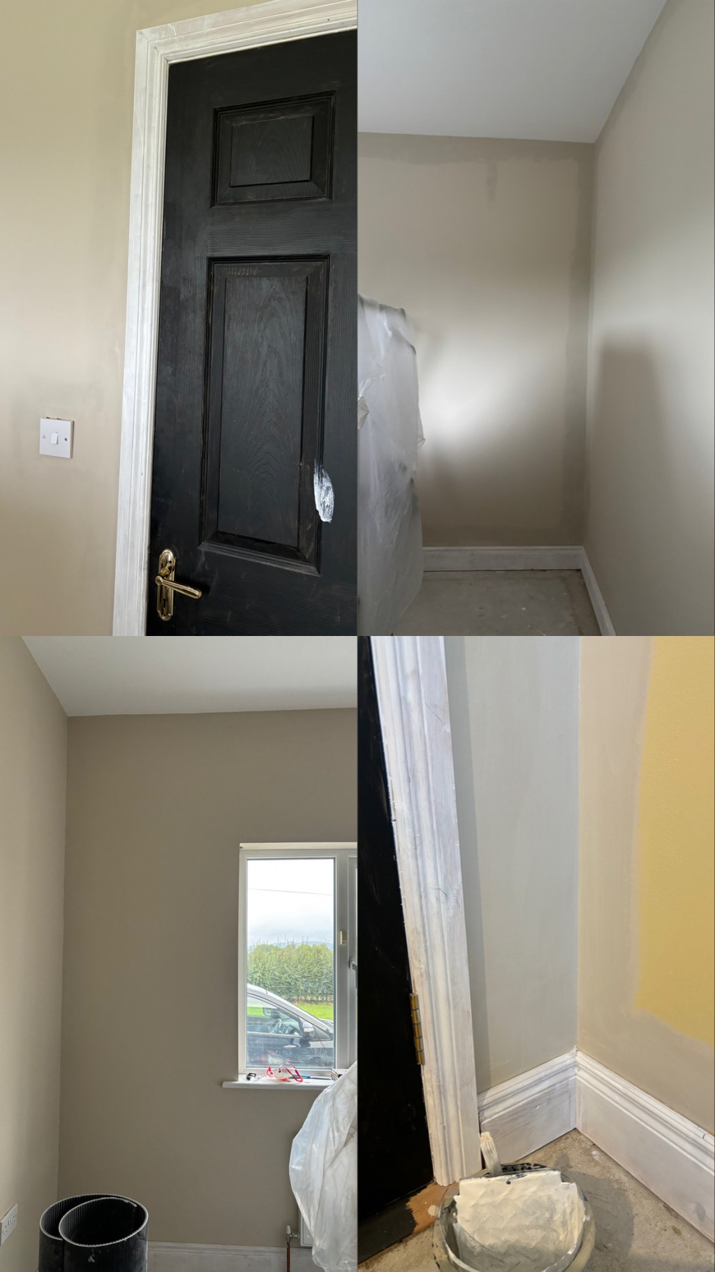
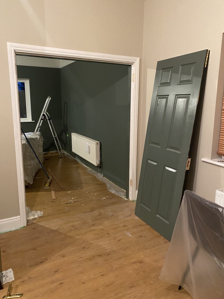
Hall: Powered Almond in Fleetwoods Easy Clean Range. I have always wanted that Victorian ‘wow’ when you open your front door & see the checkered floor/‘tiled’ mat & black doors with the white trim, modernised with the cosiest light grey. Finding this colour nearly broke me. We have a traditional bungalow hallway to our bedrooms, it’s dark. Every single grey I put on the walls was cold & blue looking. Minus the flooring (one day we’ll switch it out & might convince Martin to do my ‘tile’ mat…), I smile every single time I walk in the front door. It really is exactly what I wanted.
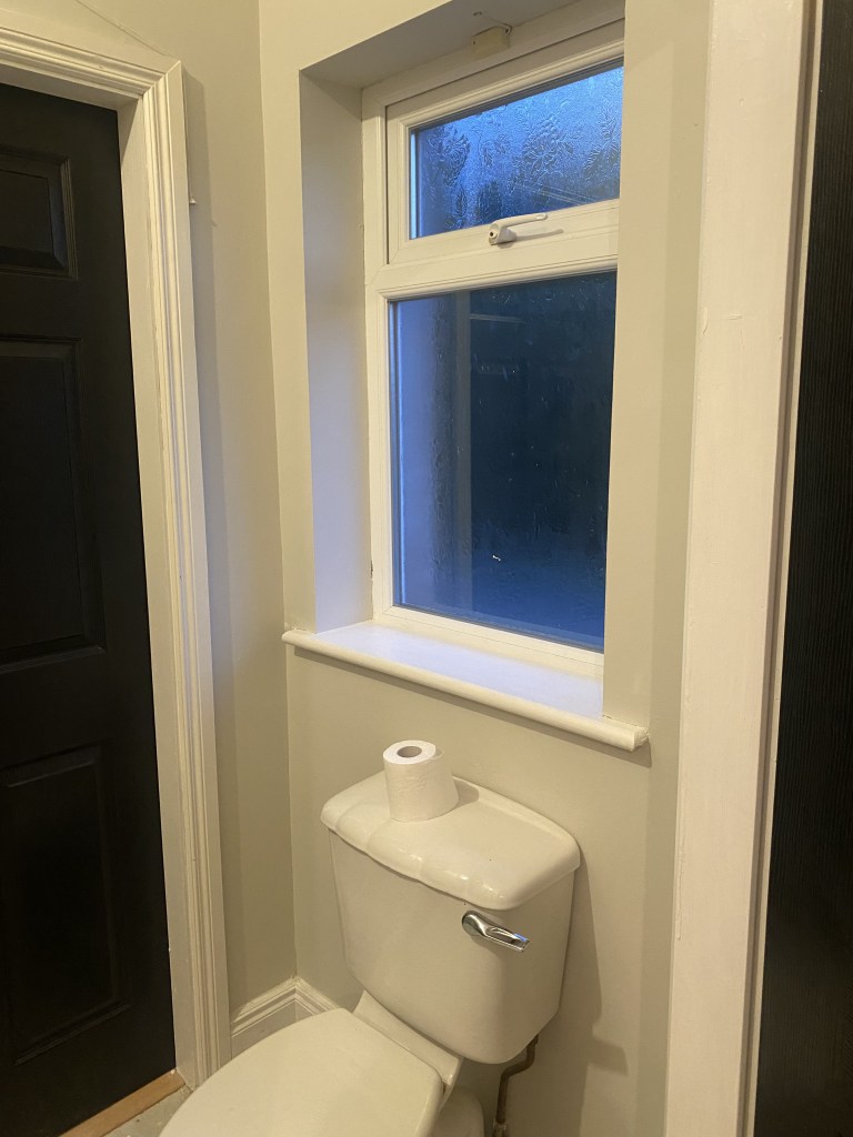
En Suite: Egyptian Cotton by Dulux mixed by Crown Scrubbable paint. This I always thought was a more griege colour than how it turned out. However, its important to remember colours will bounce off what you style them with. Our en suite has a lot of greys going on & so this is definitely more in the grey category for our home. But we really love it. Very light & airy while giving a cosy vibe.
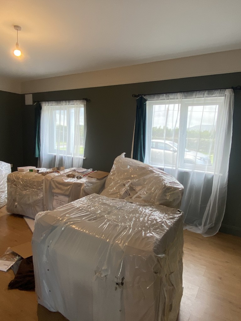
Dado Rail: Highline White by Fleetwood. This is one of their prestige colours & it is beautiful. It is a perfect off white matched with their smoking room green in our living room. I had hoped to use one of their Hepburn colours here, but with this green it was just too grey. I’m glad we went slightly lighter.
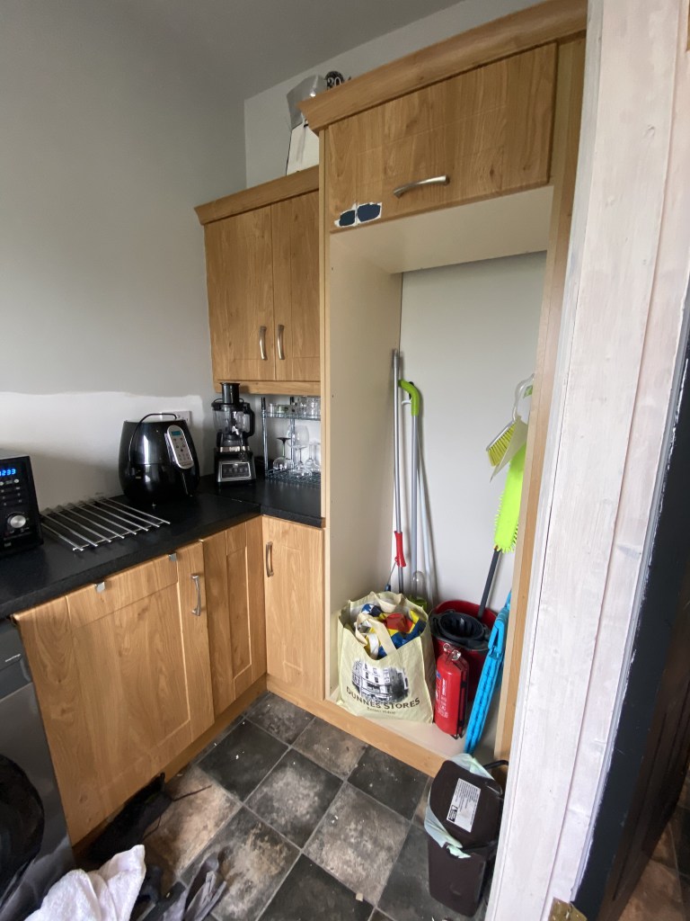
Utility: Hepburn Light by Fleetwood. Again, another prestige colour. And once we finally paint the cupboards our navy, it will give that perfect navy & light grey tone we love. We plan to finish with some subway tiles & brass cupboard handles to give the whole room a new lease of life.

Leave a comment